QTL Mapping with Multiple Markers
With two markers, it is possible to locate the QTL and estimate its effect. Suppose now that we have two markers, 34 cM apart; marker locus A carries alleles AQ, AP and locus B carries BQ, BP (Fig. WN14.1). In the F2, we see nine genotypes, which again are associated with the trait. The vertical lines in the figure show the means of the nine genotypes, and Table WN14.1 gives the numbers of each genotype in a sample of 1000 F2 individuals and the trait means.
If we look at the loci one at a time, we see that the mean trait values of AQAQ, APAQ, APAP are {–0.241, –0.071, 0.381}; thus, each additional AP allele is associated with an increase of 0.311 in the trait. Similarly, genotypes at the second marker locus have means {–0.225, 0.051, 0.112}, with an average effect of BP of 0.168. This immediately suggests that the QTL is nearer the first marker than the second. We can get an approximate estimate of the effect and position by setting 0.311 = α(1 – 2c1), 0.168 = α(1 – 2c2), where α is the effect of the QTL, and c1, c2 are the recombination rates to the markers on the left and right. To a good approximatation, c1 + c2 = 0.34 (i.e., 34 cM). This gives α = 0.36 and c1 = 7.1 cM.
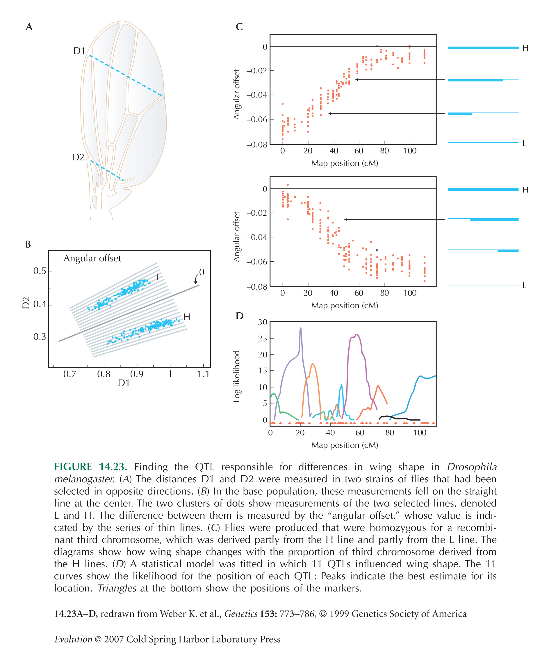
A more accurate estimate can be found by calculating the likelihood that the data would be observed, given certain values of effect α and map position r1. Figure WN14.2 shows the algorithm of the likelihood plotted against position on the genetic map; the first marker is on the left and the second marker on the right. The best estimate of the QTL position is at 12.7 cM. The horizontal line shows the conventional threshold for significance, 2 units of log likelihood below the maximum. The best estimates of the QTL effect and position are α = 0.54, c1 = 12 cM. (In this example, the dataset was generated assuming α = 0.5 and map position 11 cM, so the estimates are quite accurate.) Most estimates of QTL position and effect are presented using plots of log likelihood against map position of this sort (e.g., Fig. 14.23D).
In practice, QTLs are detected using large numbers of markers spread over the genome. However, the basic method is the same: Usually, successive pairs of markers are considered, and the location and effect of a single QTL within each interval is estimated, as above. Using multiple markers gives more statistical power but also introduces several complications. When large numbers of statistical tests are made, for large numbers of intervals, some will be significant by chance, even if there is no QTL. Thus, care must be taken to set the right overall threshold for significance. The problem becomes still worse if dominance or epistasis is suspected, because then the number of parameters to be fitted becomes very large indeed. These issues are discussed further in Chapter 26 (pp. 761–763) and in the accompanying Web Notes.
|


